Here I sit at another dog show trying to figure out how to pass the abundance of downtime that comes with these agility events. Working in my favor, for a change, is I still need to get some posts in to close out the month. Knowing the show was coming up gave some security that as long as the post processing was done on the images and the upload to the Smugmug gallery went without a hitch only thing left to do was find time to spew out some words – maybe even in readable sentences! Processing done – check, upload successful – check – some free time … crap loads.
Keeping with the theme of all the barking dogs crated around me, today’s post returns us to the ancestry of the domestic dog. Not sure if it was mentioned in the previous Wolf post (link here), but that post was really a three parter. A trifecta if you will since that specific shot resulted in three very distinct post processing opportunities. The previous shot was the standard color treatment, but likely unnoticed by you, there were some subtle differences in the final processing of those. Specifically the contrast was amped a little more than usual to darken the background. This provided better separation between the wolf and the foliage in the background. Although it does make a slightly better image in terms of color, where it really makes an impact is when you convert it to …

Welcome to my new favorite set of photographs. Although there were a few sample tests during the color processing I wasn’t entirely sure how it was going to turn out. Admittedly a very biased opinion, but I really really like them. My favorite shots are the one above and below (and one a little further down) – can’t decide between these two which I like more for sure, but leaning to the first one due to the more symmetrical ears.. at the cost of the wolf staring directly at the viewer in the one below. Hit the comments section and give me your thoughts.. which as always are valuable input into the upcoming competition season – Linda’s already beginning to worry but the Yellowstone trip is coming up and that is a rich environment for her preferred subjects. Some photobombing may be in order hehehehe.

Hit the link to see more of these B&W wolf shots!
I am still not overly confident in the black and white digital darkroom, but the work on the Allerton shoot (link here) help to get familiar with the digital controls available in Lightroom. They have changed a bit in the newer version but for the most part the techniques tended to transfer over to the new 4 controls. By the way, kudos to Adobe for providing the option to use the old controls if the RAWs were loaded into version 3. Decided like there was no time like the present so opted to use the new controls anyway.

The following shot is probably my least favorite of the formal portrait shots. Wolves just look so much more intimidating when their ears are cropped up – it can hear you and therefore you are in definite danger. The fear simply subsides when they drop making it look more like a domestic dog. Maybe it is ruse to draw you puny humans in closer.
Now for the other image I really liked out of the set. Lurking out in the cover of the forest preparing for the kill

As with the color version it would have been better if the sprays of grass were further off the face but at least there was enough room to move it completely off the face when composing it. To its credit, the grass does force the viewers eye directly to the eyes of the wolf. Feeling like a deer right now?
Closing out this set, here is a great example of when black and white ends up being a much better option. The color version has some lighting issues if you look at various locations in the fur. This is due to light making its way through the brush. These lighter spots really get overlooked in the black and white version and almost look like differences in the fur coloring rather than harsh light making its unwelcome appearance. Something to keep in mind if you have a nice shot but maybe has some annoying sun spots you want to hide.

I do like this shot, but doesn’t give the same feel as one where the eyes are targeting the viewer – almost makes us a passive onlooker to the impending kill rather than the potential prey.
Hope you enjoyed this set of shots. I think this represents a marked improvement in my black and white work – still a long way to go, but then again, it is a journey.
Howl you later!

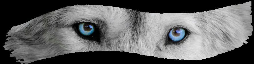
As I’ve expressed in person, these are fantastic! I saw your ones with the blue eyes left in their original color, and those are also extremely striking. I like these B&W photos a lot.
Question: B&W print film provided excellent gradation of gray values. How does digitally grayscaling a photo compare in that regard, do you know?
Ron
whoa whoa whoa … let’s not let the cat out of the bag yet. Please ignore any inference as to the nature of the third entry in this set .. nothing to see here.. look squirrel.
Thanks for the compliment (you know these were taken by me right.. not Linda? hehehe). I think the amped up clarity on the color version really helped on the B&W treatment – a little more crisper. As far as the B&W print film, I really can’t answer that other than comment that there are some cameras out there (Canon for example) have a selling point for putting it in B&W mode. I personally see ZERO reason to do that but I might be missing something that correlates with your statement regarding film. In the digital darkroom front, I have a lot of control of the tonal curves so guessing I can get them pretty darn close. As you saw, there is definitely a difference how they look when printed on special B&W paper – a lot darker shades of black than I got with the the next treatment post.
Thanks for taking the time to comment!